Craciela Iturbibe
Objective
To create a 12-page booklet that visually showcases the work and career of Graciela Iturbide, using thoughtful typography and imagery to reflect her artistic journey. The design serves as an engaging tribute to her impact on photography and Mexican culture, capturing the essence of her visual storytelling.
Focus
Editorial Design | Visual Storytelling | Typography
Key Words
Storytelling | Culture | Creativity | Typography | Photography

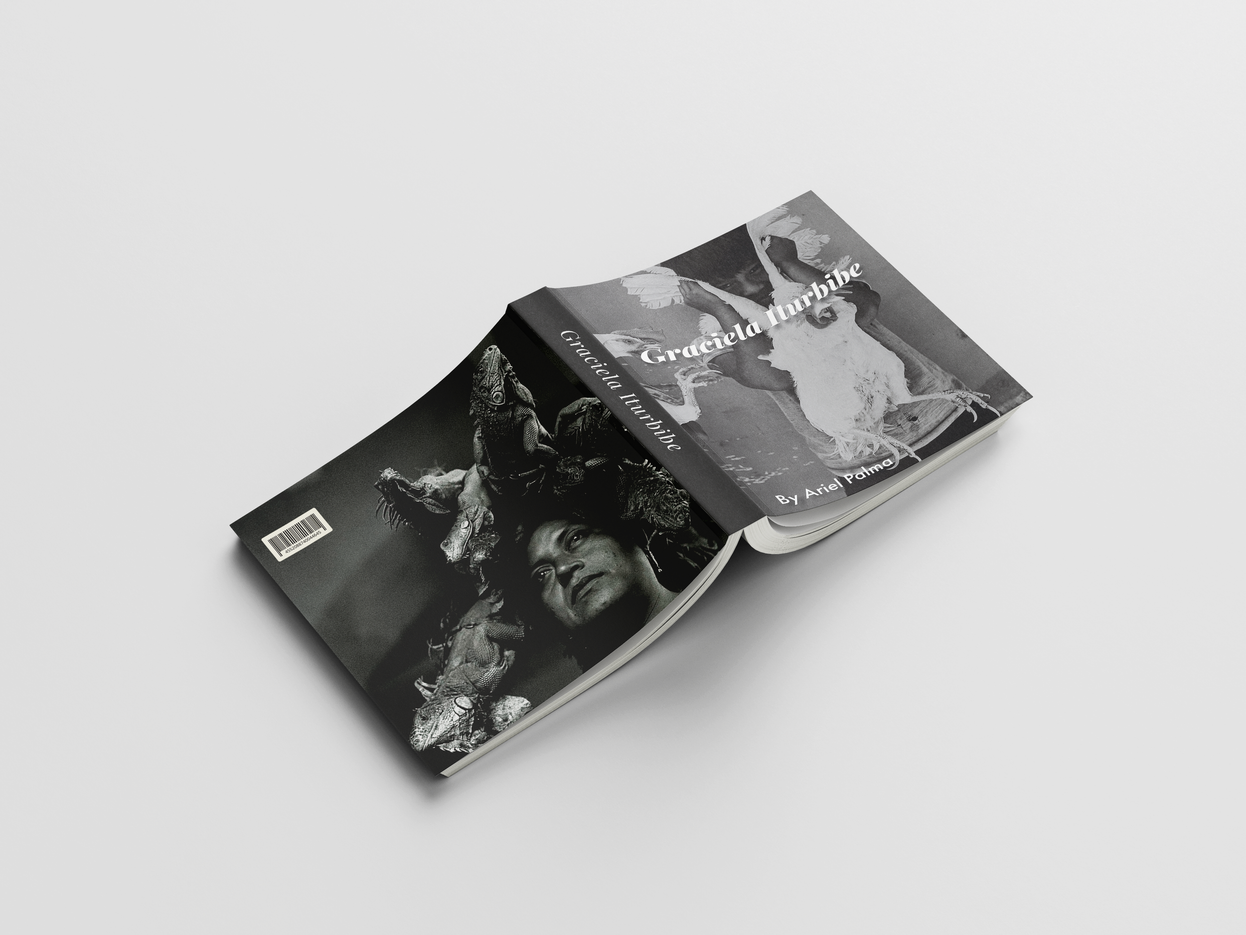
The title on the book cover is set in Playfair Display Bold Italic to convey elegance and sophistication, reflecting the timeless quality of Graciela Iturbide's black-and-white photography. The bold italic style adds a touch of drama and emphasis, ensuring the title stands out prominently and captures the viewer's attention, much like Iturbide's impactful images.
Sketch
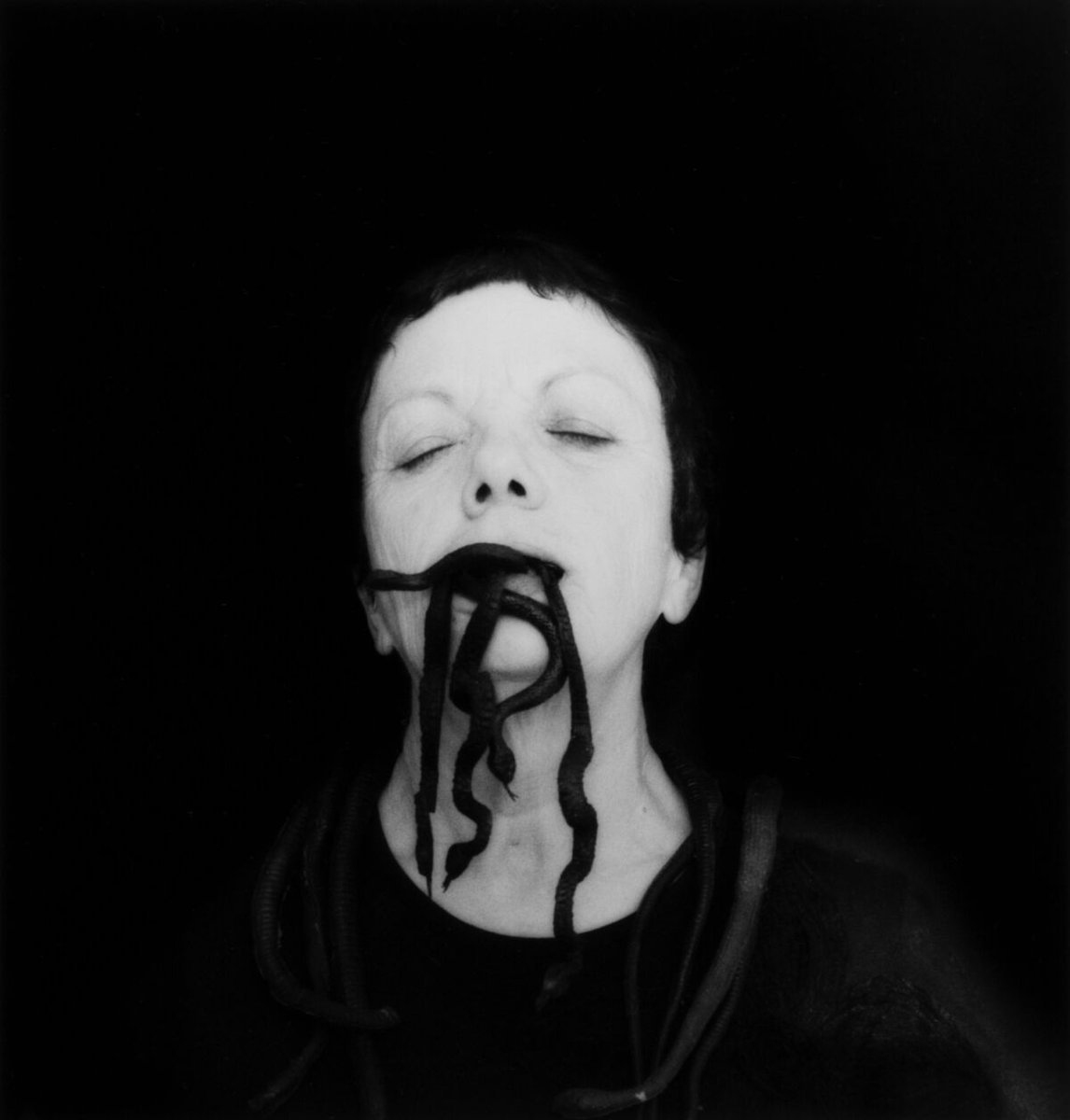
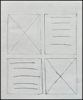
One of the biggest challenges I faced in designing this page layout was selecting the right image to represent the profound artistry of Graciela Iturbide.
First Iteration
The first iteration of the booklet had inconsistent text rags, creating awkward spacing and poor flow. The color choices were also ineffective, lacking contrast and cohesion, which made the design look cluttered and unrefined.
Final Product
The final product resolved these issues with cleaner text rags, creating a more even and professional layout. The color choices were improved, offering better contrast and enhancing readability while aligning with the theme. The overall design is now more cohesive, with a smoother visual flow that guides the reader naturally from page to page.


