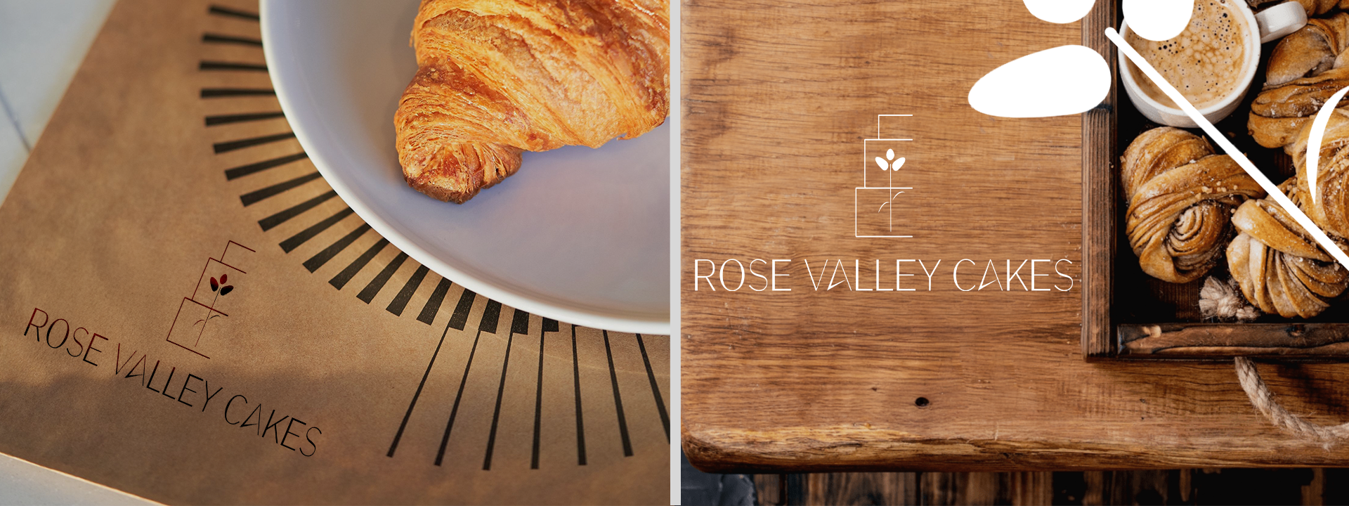
ROSE VALLEY CAKES
Objective
Focus
Branding & Brand Identity | Logo Design | Editorial Design | Web Design | Typography
Key Words
Rebrand| Modernization | Visual Language
To rebrand and strengthen the company's identity by refining its logo, color palette, and typography to better align with its core values. This project also focused on enhancing brand messaging to establish a modern and relatable tone, creating a more effective connection with the target audience.
Commision Work 2025
Logo Development
Enviromental Contact
Rose Valley Cakes’ previous logo feels nostalgic and delicate, with its ornate floral illustration and soft, pastel color palette. While it effectively communicates a handcrafted, boutique feel, it lacks the modern versatility and visual clarity expected in today’s design landscape. The new logo embraces a bold, minimal direction—simplifying the cake and floral elements into clean, geometric forms and introducing a sharp, modern typeface. This rebrand elevates the brand’s identity, offering a sleek and professional presence that works seamlessly across packaging, signage, and digital platforms.
Palette
The updated color palette introduces bold, contrasting tones—vibrant magenta and rich ochre—that feel both fresh and unconventional. These shades break from tradition, symbolizing the brand’s confidence, creativity, and modern sensibility.


